


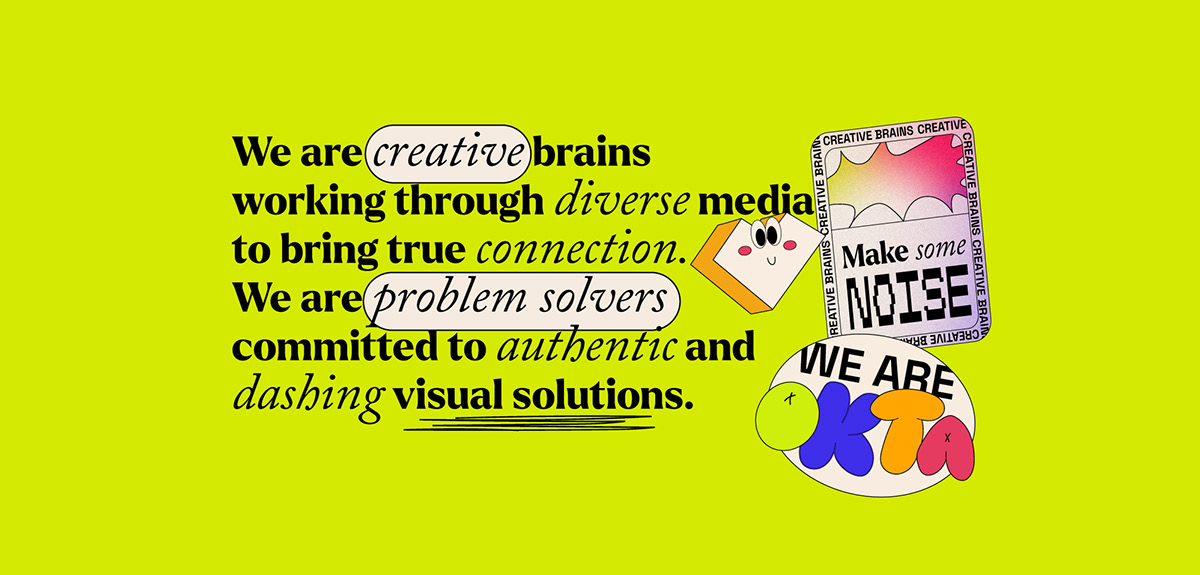
Rebranding is a challenge for any company, it is an even bigger challenge when we do it in our own company. Okta Branding was strictly a Branding Studio. When life happened and chaos emerged, the two owners (that's us) remaining went through a long self-reflecting journey to figure out what we wanted. We felt like Okta was a little uptight for us. We needed a little push to get our motivation going, we needed something that represented our good spirit and our love for bold design and fun copy, as well as showing our new services.
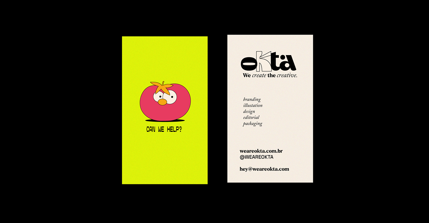
We wanted our logo, our colors and our graphics to represent the enthusiasm and versatility that is us. The main question for this project was: why not? So, a logo with different K's? (After all, K is the standout letter in Okta.) Why not? Stickers? Why not? A bright green? Why not? We embrace it all, we are creative, we are experimental, we are problem solvers, we are Okta and we have arrived.
We wanted our logo, our colors and our graphics to represent the enthusiasm and versatility that is us. The main question for this project was: why not? So, a logo with different K's? (After all, K is the standout letter in Okta.) Why not? Stickers? Why not? A bright green? Why not? We embrace it all, we are creative, we are experimental, we are problem solvers, we are Okta and we have arrived.


: Paula Rego and Luísa Fantinel
A big thank you to HarborType for refining our logo
: Paula Rego and Luísa Fantinel
A big thank you to HarborType for refining our logo
2024 | Brazil
Thank you!
Let's talk about your project at:
Thank you!
Let's talk about your project at:
hey@weareokta.com


